





Project Details
-
Client:Sean Whittaker & Blaise Botta / X Wellness
-
Industry:Wellness, Health & Lifestyle Brand
-
Role:Logo Design, Brand Mark Development, Typography Direction & Visual Identity
-
Brand Feel:Clean, Balanced, Modern, Calm & Professional
-
Project Type:Graphic Design
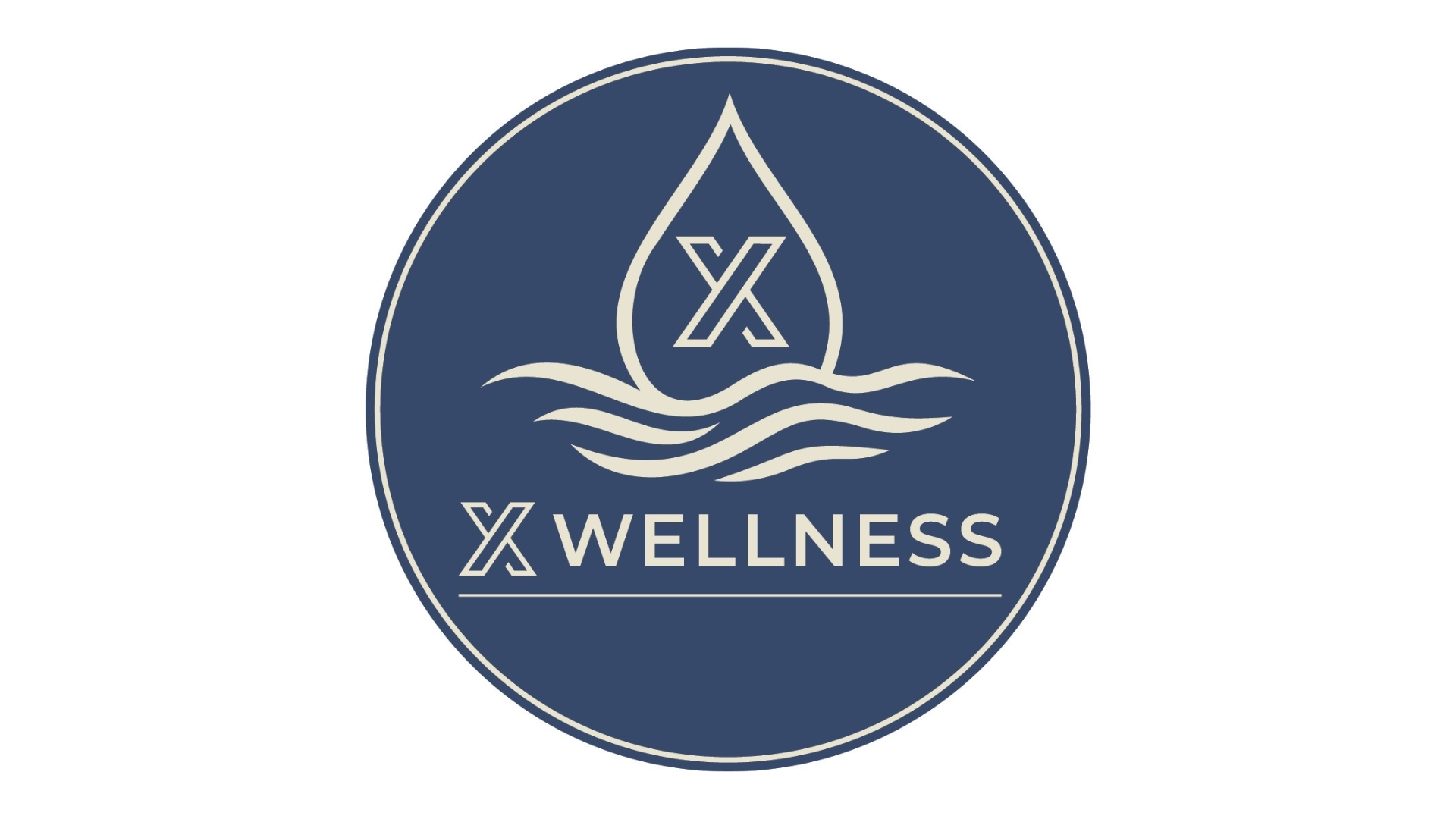
X Wellness logo design featuring a modern circular badge, water droplet icon, wave elements, and clean wellness-focused typography.
Project Overview
X Wellness was a logo design project for Sean Whittaker and Blaise Botta. The goal was to create a clean and professional visual identity that could represent a wellness-focused brand with a calm, balanced, and modern feel.
Logo Direction
The logo was designed as a circular badge with a strong central symbol combining a water droplet, wave elements, and an X mark. The visual direction communicates wellness, movement, balance, and clarity while keeping the mark simple enough to work across different brand applications.
Brand Identity
The color palette and typography were chosen to feel calm, trustworthy, and polished. The deep blue and warm cream combination gives the mark a premium but approachable look, while the icon system creates a memorable identity for the wellness space.
Impact
The finished logo gave X Wellness a strong visual foundation that can be used across digital materials, signage, apparel, social media, print pieces, and future brand extensions. The project created a simple but distinctive identity for a wellness-focused business.